






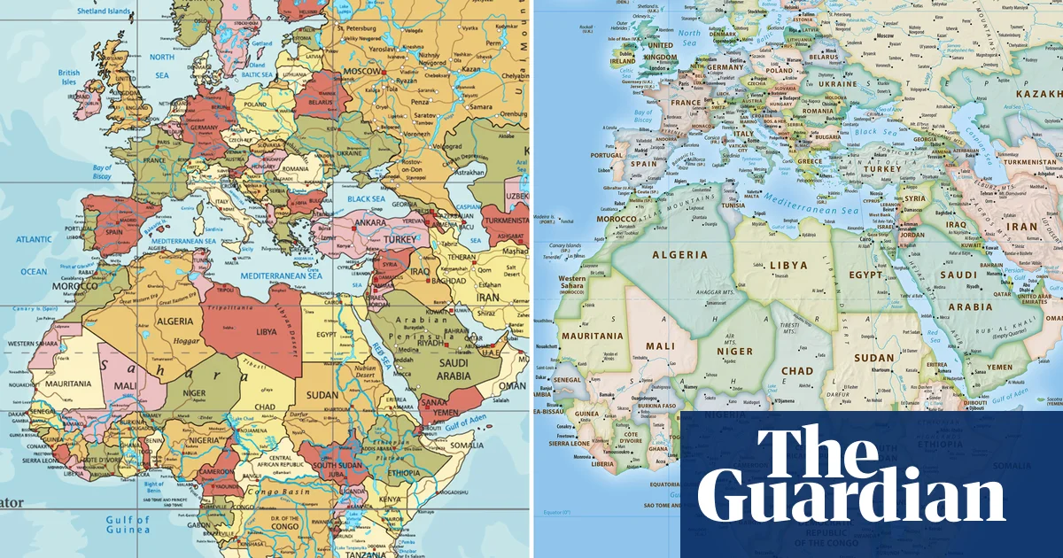
On September 4, 2026, at the United Nations headquarters in New York, the General Assembly voted to formally retire the Mercator projection, the 16th-century world map that has shaped global perception for generations, and replace it with the 2018 Equal Earth design, a far more accurate representation of the planet’s landmasses. The resolution, sponsored by Togo, specifically targeted the Mercator map’s most glaring distortion: its depiction of Africa as roughly similar in size to Greenland, when in reality the African continent is approximately 14 times larger.
A Map Built for Ships, Not for Truth
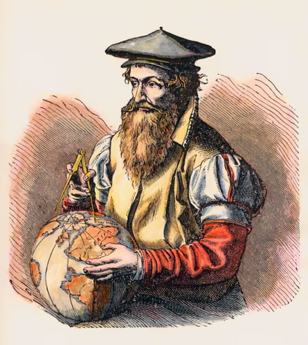
The Mercator projection was never designed to be a political statement. When Flemish cartographer Gerardus Mercator created it in 1569, his goal was practical and specific: help sailors navigate the oceans using straight compass lines. For that narrow purpose, it worked brilliantly. The problem is that the projection dramatically distorts land size as you move away from the equator, inflating regions closer to the poles and compressing those closer to it.
The result? Greenland, an island of roughly 836,000 square miles, appears on Mercator maps as roughly equal in size to Africa, a continent spanning approximately 11.7 million square miles. Canada and Russia balloon to enormous proportions, while countries in the Global South, many of them across Africa, Latin America, and Southeast Asia, appear far smaller than they actually are.
That distortion has never been a neutral quirk of geometry. Critics have argued for decades that it subtly reinforces a worldview in which the global north appears dominant, central, and large, while vast stretches of the southern hemisphere look peripheral and small. When children grow up reading those maps in classrooms, the visual impression sticks.
Togo Takes the Fight to the General Assembly
The Togo-sponsored resolution that passed at the UN General Assembly calls on member states to phase out Mercator-based mapping in official contexts and transition toward the Equal Earth projection, a design introduced in 2018 by a team of cartographers committed to producing a visually appealing yet proportionally accurate alternative.
The Equal Earth projection maintains the correct relative sizes of all continents and landmasses, meaning Africa finally appears as the colossal landmass it actually is. It also preserves a recognisable, aesthetically coherent shape, which is no small feat in cartographic design. Many earlier attempts at equal-area maps, including the Peters projection from the 1970s, were technically accurate but visually awkward, which limited their adoption in schools and media.
Togo’s decision to sponsor the resolution reflects a broader push across African nations to correct what many see as centuries of visual misrepresentation. The continent houses over 1.4 billion people across 54 countries, contains some of the world’s largest river systems, deserts, and rainforests, and sits at the geographic centre of the planet’s landmass. None of that has ever been legible in a Mercator projection.
Why This Vote Is About More Than Geography
Strip away the cartographic jargon and this vote is really about something more fundamental: how we see the world shapes how we think about it. Maps are not passive records of physical reality. They are choices, arguments made in colour and line about what matters, what is central, and what is large.
The Mercator map placed Europe at the visual centre of the world and made northern hemisphere nations look imposing. Schoolchildren in Lagos, Nairobi, Accra, and Kinshasa grew up looking at maps that made their entire continent look smaller than a mostly uninhabited Arctic island. That is not a minor cartographic footnote. It is a visual narrative that has influenced policy thinking, international aid framing, and cultural self-perception for generations.
The Equal Earth projection corrects that narrative without requiring anyone to accept a bizarre or unfamiliar image of the globe. It looks like a world map. It just happens to be an honest one.
What Actually Changes on the Ground
The UN resolution is not a binding international law. It cannot force a textbook publisher in Ohio or a news organisation in Berlin to swap out their maps overnight. What it does is create a formal, multilateral signal that the international community considers the Mercator projection outdated and misleading in official contexts.
Historically, UN resolutions on standards and norms carry real weight. They influence how governments design educational curricula, how intergovernmental organisations produce reports, and how development agencies frame their communications. Over time, that kind of institutional pressure filters down into classrooms, newsrooms, and boardrooms.
Cartographers and geographers who have long championed more accurate projections have welcomed the vote as a watershed moment. The Equal Earth design was specifically built to be usable at scale, printable, and immediately familiar to anyone who has ever looked at a world map. That accessibility is exactly what made previous equal-area alternatives difficult to mainstream.
The Long Road to Cartographic Justice
This is not the first time the Mercator projection’s distortions have drawn serious criticism. The debate has simmered in academic geography circles since at least the mid-20th century, and the Peters projection became something of a cause célèbre in development circles during the 1970s and 1980s. Some schools in Germany and Australia adopted alternative maps for a period, and the Boston public school district made headlines in 2017 when it switched to the Peters projection in classrooms.
But those were isolated decisions by individual institutions. What happened at the UN General Assembly on September 4, 2026, is categorically different. It is the first time the world’s primary multilateral body has collectively weighed in on which map best serves humanity’s shared understanding of the planet, and voted to change course.
Africa is not a small place squeezed between two oceans. It is a continent that could fit the continental United States, China, India, and most of Europe within its borders simultaneously. It’s about time the map we all grew up with started reflecting that reality.
So here is the question worth sitting with: if something as fundamental as a world map can distort global thinking for 500 years without most people noticing, what other visual frameworks are quietly shaping the way we understand power, size, and importance, and who benefits from leaving them unchallenged?